Showing posts with label I. Appendix 3: research and pre-production planning for ancillary texts. Show all posts

Sunday, 14 April 2013

Drafts for Poster, Magazine cover and Moodboard


The image above is my rough drawing of what I would like my film poster too look like. The image I will be using is of the mask we used as a prop, hanging on coat hooks in some changing rooms. My idea is simple and doesn't give any information away of what the trailer or film is about.


The image above is my rough designs for my film magazine cover. It uses the mask from the trailer and just like the poster doesn't reveal any information of the film, making it seem mysterious and the audience more curious about it. I feel that this will draw the audience in more, making them think and desperate to know more.

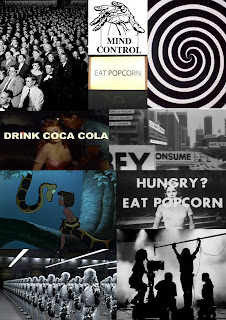
This is my mood board for our trailer. It's filled with images with a subliminal meaning. Subliminal messages that have been used in films and adverts before. This mood board explains the meaning of Subliminal messages, and gives examples.

General Audience Research

Horror films are not for me, but for many other people they are. People enjoy the tense build up scenes and the sight of a man being slaughtered alive. The intense adrenaline rush the audience gain from watching a horror film is what keeps people going to see them, which then keeps the genre of horror popular and in business.
Horror films are mostly viewed by males, from in the cinema or sitting at home. This is mostly because the bloody scenes do not appeal to females, it put's them off rather than draws them in. Females are typically more into romantic, love based films, often a shared experience with their boyfriend.
Statistically, Horror films are one of the most unpopular genres around to this day. This may be because of other genres growing to impress people, action or thriller films are very popular, because of the age availability and non scary/ bloody scenes that repulse the audience.

Independant Audience Research


For this independent research I made a questionnaire and handed it out around college, the results I gained were the results I was aiming for. The idea of this questionnaire was to gain knowledge of what the audience are interested in and wanted to see, also it helped to back up my idea and give me the confidence to continue with my trailer.
In total, I think this questionnaire was very helpful, it helped me understand what the audience from my teams age range wanted to see, in the trailers, posters and magazine covers.

Empire magazine analysis


This is the magazine I liked best, I am going to use a similar layout to this magazine cover. I like the simplicity of the image and it's background. The main image is in back and white which makes the image look more detailed, the audience is not distracted by the colour in the image and will look at the shadows and shading in the image.
Another reason I like the idea of a black and white image is because it makes the colour of the title really stand out and obvious. The title lays beneath the main image, making it obvious that the main image is what's important and makes the film look more dominant.
The only sub title on this cover is the title of the film that is featuring in this months magazine. The rest of the writing is the release date, price and month of the issue.
The barcode is in usual place and also blends in with the black and white theme of the magazine cover.
The plain white background makes Bond's black suit really stand out against the white. But I do feel like it's a bit boring, maybe if it had some sort of shattered glass effect or worn paper effect.

Total Film magazine analysis


The title of this magazine is in the biggest font on the cover, making it obvious that it's the title. The other thing I noticed is that the 'film' in the title has been experimented with and played with to fit in with the main image and the background. Even though the text blends in it's still noticeable and stands out from the rest of the background.
The next biggest font is a sub title of what's featured in the magazine, Inception. Total Film has labelled it at the top 'The mind blowing issue', this is also relevant to the sub title Inception. Inception is a film based in people minds, a team enters an individuals mind with a task to gain information. The sub title Inception lays on top of the main image but not covering the face or any key part of the image.
There is also a circle shape that has an effect as a sticker, this also grabbed my attention, separating itself from the rest of the cover. It's another sub title explaining that there is information of a new film coming out in the magazine.
The barcode is in a typical place, barcodes always seem to be in either bottom corner of the magazine, keeping out the way of the main image, sub titles and any other information on the cover.

Horror magazine analysis


The title of the magazine stands out from the rest of the text on that page because of the purple background and the red outline on the black text that states 'Fangoria', making it eye catching and obvious that it is the title of the magazine.
There are also lots of sub titles on the front cover, introducing what is going to be inside the issue of the magazine. The most important sub title is the text above and below the title of the magazine. "Fangoria - presents, Best and Bloodiest Horror Video" this text is also as important as the title of the magazine because it explains that this magazine is a limited edition magazine about the top rated Horror Video. The texts front range in style but the magazine title is on a separate background making it obvious it's the title.
This magazine also uses three little pictures besides the main image in the middle of the magazine. These images are example of what other films are up for the title of "Best and Bloodiest Horror Video". The main image grabbed my attention, straight away I knew this magazine was a Horror based magazine. The main image is Freddy Krueger from A Nightmare on Elm Street, the image captures his burns and his aggressive expression seeking for revenge.

Saturday, 13 April 2013

Jaws poster analysis


The reason I chose to analysis this film poster is because of how basic and simple it is. This poster consists of the film title, and a drawn image of the moment before a shark attack. Straight away with combination of the title and image it's clear what this film is going to be about. The sea is huge, taking up the highest percentage of room on earth, the deeper the sea is the darker it is, and what we can't see in the dark scares us. This is why I think they have used this image in their poster, the shark looks like it's coming out of the deep dark sea and the shark is very well blended in, colour wise.
There is no slogan or any other information apart from the title of the film and the clue of the image they have used. The colour of the font is red, which is very common in horror posters because red implies danger and sometimes death. The colour red in this poster also stands out really well from the white sky and blue sea. The actual font looks quite cartoon based and not so sinister in my opinion. The image looks like it has been drawn which allows the artist to place the lighting and shading where it is most effective on the characters. Most of the lighting on the shark has been placed on the teeth as well as the outline of the shark and it's features that makes the audience notice it's a shark. The teeth look like they have been over exaggerated maybe to link with the film title or to make the shark look more frightening.

Friday 13th poster analysis


The thing I like most about this poster is that it has an empty feel to it. There is no slogan or any information given away. The only thing in this poster is a mask and the release date. These are the only two things in the poster which give no clue about the film, I like this because it seems mysterious.
Another form that encourages the empty feel in this poster, is the plain black background, there is no other colour or object of effect that makes it seem that there is anything there e.g. a doorway, shadow or light source. This not being about to see anything makes it more scary, there could be anything there behind the mask, someone could actually be wearing the mask but because of the lighting we are unable to see it. The darkness is the easiest but most scariest thing that you could use in a horror film, not being able to see what is there makes our minds wonder and imagine what could be there. Simple yet very effective.
The lighting on the mask is very well done, the lighting makes the mask look like it is fading away into the darkness, or coming out from the darkness. The lighting is hitting the mask at an angle which allows the scratches, dents and worn parts show. This old battered up and worn mask is typically a very scary prop, the scratches and marks hold stories of what the mask has been through, this gives off another mysterious effect that makes the audience fearful but curious.
Because of my film knowledge I know that 'February 13' is the release date not the name of the film, this poster is for Friday the 13th. It makes me wonder why they didn't add the title of the film but only the release date, but then I realised that February 13 would probably be on a Friday of that year. This subtle hint makes the audience think about the title and release date, making them remember it, and most probably look up about it or just go and watch it without looking into it. Another simple but very effective technique to draw the audiences attention.

Orphan poster analysis


The slogan is used to give an idea or reveal something about the film. “There’s something wrong with Esther.” This slogan implies that there will be trouble in the film, or that something bad will happen to Esther or something bad will happen because of Esther. The slogan leaves a cliff hanger, leaving the audience wanting more. This slogan runs along the top of the poster, and it's written in thick bold text to draw attention to it.
The background in this poster is really dull and basic. It looks like she’s just standing in front of a hospital/ medical related wall. It's dark which is common for slasher/horror films, hinting from first glance that it's going to be a dark film. The lighting has been fully focused on Esther’s face; the light has been made to give Esther evil looking shadows on her cheeks and eyes. The way Esther's face has been lightened shows that there is two different sides to her character in this film. The font used in this poster is naïve and childlike implying the film is based around or uses children. The font looks like it has been scratched out with a sharp object or weapon, which implies that it is a horror film. They have made the release date bigger than all the other text, but not as big as the title so it stands out. They add the release date onto the poster so they know when it comes out so they can go and see it, also adding it onto the poster makes the audience who liked the poster and read the poster, remember when it is released. Esther has  ribbons has black ribbons in her hair which is typically seen as something a young female would wear. Esther also seems to be wearing a ribbon around her neck with looks more sinister and evil. The clothing Esther is wearing is a blue dress which is more child typical and friendly, I think the light coloured dress and dark purple ribbon conflict each other, showing two sides of Esther.