Friday 3 May 2013
Tuesday 23 April 2013


Tuesday 16 April 2013
Evaluation Question 4
How did you use media technologies in the construction and research, planning and
evaluation stages?
The editing programme I used the most for my independent ancillary texts was Adobe Photoshop. I used the techniques I gained from my Graphic's lessons, I was able to use layers in my work. This meant I was able to keep everything I wanted on my poster or magazine cover separate, so I could move things around and change the size of things, without disrupting anything else on that page. I was also able to edit the layers into each other, making my poster and magazine cover looking smooth and professional. I could 'dissolve' the edges of the mask into the background making it look like it is actually attached to that texture. There is a small side bar of editing tools, opacity percentage and layer arrangements that I could use on my poster and magazine cover. For my magazine cover I copied and pasted the 'Empire' title so I had two, I moved the layer containing one of the titles on it below the mask layer, making it look like the title was behind the mask. I then placed the copied layer on top of the other title layer making it look like there was only one, I then moved that layer above the mask layer so it was laying on top of the mask, and lowered the opacity to 25% so it was still visible but faint enough not to distract or ruin the image of the mask.

There was also a bench in the image I used for my film poster, which I did not want in my poster. For this I rubbed out the bench leaving it invisible, then copied sections of the wall and placed them over the invisible patch. Once it was fully covered it looked better, but noticeable that I had done this. I then decided to used the 'spot healing brush tool' which allowed me to select an area that made it obvious that I have placed piece of the wall in that section. And smooth it over, and hiding the edge of the wall that was obvious, this made the patch of wall blend in with the rest of the wall hiding the fact there was ever a bench there. I then turned the image black and white using the Image Adjustments.
For the film editing as a group we used Adobe Premier Pro. This programme allowed us to add clips we had shot on our video camera, and trim them, speed them up and structure them in an order explain the plot. We trimmed down nearly every clip we used, to shorten the time of the trailer and only use the few seconds that we needed. We sped up a couple of clips, where I shook my head violently. The idea was to make Victim #2 - me, look like I was going insane. We recorded about 10 seconds worth of me shacking my head and sped it up so it only lasted 1 or 2 second, personally I think this clip was a success, I liked how it turned out and thought it was very effective and obvious.
For my research I used YouTube and Google mostly. I used Wikipedia for information about certain films and the characters in them, for example the plot of A Nightmare on Elm Street and Freddy Krueger information. I used Goggle for images and information about films/trailers/characters that I couldn't find anywhere else. YouTube was only used during my research and my three trailer analysis, apart from that I only used YouTube to show examples for a point I was trying to explain, supporting a theory.
To present my work I used this website, Blogger. Blogger is a blogging website that lets me add images, videos and text posts to present my work and the research I had done. My blog page is for the work, and research I have done to learn about the background of horror, techniques professionals use in films and trailers, and of course the process of my horror trailer.

Monday 15 April 2013
Evaluation Question 3
What have you learned from your audience feedback?
Once we thought we had finally finished the editing process and were all personally happy with the positioning of clips and the music we had to present the trailers to our class. From our class presentation of the horror trailers, we had gained negative and positive feedback that would help us improve and correct what wasn't liked, and to bolden what was liked by the audience.
Here is the list of positive feedback we gain from our classmates:Good setting x3
Good shot with mask x2
Good head shake x4
Effective shot when the enemy was lurking in the trees
Good sound, the intensity draws the audience in x6
Flows well
Clear horror feeling to the trailer, creepy x2
Good night shots
Good final shot x4
Nice use of shadows and lighting
Good voiceover
We were pleased with the positive comments and feedback. The most positive feedback we gained was for having good sound, the intensity draws the audience in. I also agree with this feedback, we chose the soundtrack because it was a slow build up using instruments of an orchestra.

One shot that was very popular is the head shake that we filmed at Isaac's house. We filmed a 10 second shot of me Victim #2 shaking my head, and then sped it up in Adobe Premier Pro, until it lasted one or two seconds long. This clip was then given a red tint to make it look more sinister and scary.
Here is the list of the negative feedback we gained:
Could be longer x3
Text too hard to read x5-"Wobbling too much"
Needs more scary scenes x2
Camera work out of focus x2
No storyline x4
More locations x2
No final shot x5
Little pace at ending
Killer in the back x3
Some of the negative feedback we gained were points that were misunderstood, there was a storyline, but from preventing the trailer from turning into a short film, we mixed and matched clips which our classmates must of not understood. No final shot was another feedback that we as a group didn't understand, there was a final shot consisting of Victim #1 - Kieran was standing in the church archway and the killer appears behind him, joined with a intense outburst of music this clip is obviously a final shot.


Another mistake that was pointed out by our classmates, was that the wobbly font used for the title and release date. This is understandable, it is difficult to read due to it wobbling too fast, if it was slower it would be easier to read. We didn't notice that the text was hard to read because we know what it said because we wrote it. If we were to change this we would either slow the movement down or decrease the amount of which the text moves.
Sunday 14 April 2013
Evaluation Question 2
How effective is the combination of your main product and ancillary texts?
As well as our final product, the horror trailer. My group independently made other ancillary texts, such as a film poster and a film magazine front cover for our final product trailer, Subliminal. More research was required for these developments, I analysed three professional horror posters and three film magazine covers.
My ancillary texts all feature images from a photo shoot we done as a group using props that are also used in the trailer, such as the mask. Together, the poster, film magazine cover and horror trailer are all obviously linked, they all feature one of the main props we used in the trailer. Even without promotion the audience would be able to tell that all three products were connected.
My ancillary texts all feature images from a photo shoot we done as a group using props that are also used in the trailer, such as the mask. Together, the poster, film magazine cover and horror trailer are all obviously linked, they all feature one of the main props we used in the trailer. Even without promotion the audience would be able to tell that all three products were connected.

Whilst making our trailer and ancillary, we had previously researched three aspects of promotion. They were audience, advertising and publicity. For the audience research we sent out questionnaires to students in the age range we were aiming for ,15 to 25 year olds.
Statistically this is the most likely age group to go and view a horror film at the cinema. Doing so we took our feedback and discussed if our film idea was ideal and what advertising techniques we should use to promote our trailer. With our feedback taken into account we proceeded with the next step, advertising.
Next we started advertising our horror trailer, the first ancillary text I made was the film poster. For the poster I used an image I thought wouldn't give much away and looked simple. Whilst on the photo shoot we placed the mask on a hook in a changing room. I chose this image for my poster, it's simple because it's resting on a hook and it already had a plain background because the hook was on a wall. The hooks in the image and the hook that mask is on, didn't really have a meaning. But from first sight it could be seen as quite sinister. A scary looking mask hanging on a hook in the middle of the wall, the audience might have started overlooking the poster and trying to imagine why it was in that setting, which is exactly what we want to happen, the film is all about messing with peoples heads and making them think. One thing I didn't like about the original image is that it had benches below the hooks in the left corner, which took away the sinister feel to the poster. So, using Adobe Photoshop I rubbed out the benches and replaced the empty patch with more of the same wall. I then made the image black and white and added a red film title at the top so it stood out. I also added mine and my teams names because we all starred in the trailer.

The next ancillary text I made to promote our trailer was the film magazine cover. For this development I used a already existing film magazine cover beneath mine as a guide for the title and positioning. I decided to keep with the black and white theme, like the poster because it brings out more details on the mask and makes it look more professional and sinister. Also with the background and image being black and white, the red text really stands out. I add a slogan to my magazine cover because I thought it looked a bit too empty and boring. This slogan fills negative space and also makes the audience think, almost like a clue for what is going to happen in the film. Another thing I added to stop it from looking too plain and boring, is a textured background, I also had to turn this texture black and white, but I think it works well, it stops the cover from looking to plain and it's not taking any attention away from the mask. I filled the rest of the edges with information of what is featured in the magazine, I think I have evenly spaced them out with the right amount of text and size of text so it looks even and professional. I placed the film title over the mask, but kept it off of the mouth and eye holes so it didn't disrupt the image, this way the image still gains the attention but is obvious that the title is connected with the image.

Together, our main products and my ancillary texts work very well together, they all include the iconic mask and reveal nothing, which makes it mysterious. I think the poster and magazine cover would keep the audience wondering and curious which is very effective in terms of the plot of the film. The mysterious effect of the poster and magazine cover support the film and keeps the audience thinking.
Evaluation Question 1
In what way does your media product use, develop or challenge forms and conventions of real media products?
Whilst I was analysing horror trailers earlier on in my blog, I began to notice a connection between the trailers. They all share similar forms and conventions, just like I think our group trailer has with professionally made trailers.
I believe our group horror trailer has the similar qualities to a professionally made trailer, we have pointed out the features and typical lay out of horror trailers and used them in our own trailer. One of the first things we noticed was that there is always a slow start at the beginning of a horror trailer. I think producers do this to set a calm atmosphere which will then make the build up much more powerful. The slow starts will usually consist of sunny scenes with lots of clear lighting, maybe a laughter shot of one of the characters and if not pop, happy music then no music. Around about thirty seconds into the trailer the mood of the music and setting will change. There will usually be a title come up, this is a clear sign that the build up is about to begin. Produces use the build up to show what the audience should be expecting in the film, the calm start was merely to explain the storyline. Once the trailer has started speeding up, scene shot will start becoming shorter and faster. Producers do this to raise the audiences reactions and have them feel the atmosphere becoming more tense and scary.

Our group trailer has done this, the calm atmosphere is set, we have a slow start with sunny well lit scenes. The scene begins with a couple of friends driving around the countryside having a chat listening to the radio. Once it starts getting darker we have cued for the music and action to start then. Just like a professionally made trailer we gradually start speeding up and shortening our clips.
The atmosphere at this point in our trailer has started taking a turn. From a calm mood to now quick shots of the two boys wondering round the church and witnessing the killer. For this build up the music played a huge part, the audio we found started off slow and slowly sped up and got loud. This audio track ended up fitting in perfectly with out trailer, we were able to cut it down so the audio would build up with the clips. The audio in professional trailer is always in perfect timing with the clips and almost reflect what is happening in the clips at the time.

There will often be a finishing scene that the producer will add to make the audience jump, or leave them wanting to see more. This end clip is key because it's the last shot the audience will see and remember, if it makes the viewer jump or wanting more then the viewer is more likely to remember the trailer and want to go see the film.

The setting for our trailer worked really well with our storyline, finding some old ruins of a church would make an interesting place to investigate. Old abandoned ruins are always a typical place for a horror film, for example Chernobyl Diaries took place in the ruins of Chernobyl. The reason is because the cast think the place is empty, this is usually the calm part of the trailer and then once they see someone it's a shock to the audience and then the producer can build up the tension using chase scenes and clips of people being captured or killed.

The date and title of the film is always shown at the end of the film so there is more chance of the audience remembering the name and release date of the film. This is another thing we took inspiration from, we put our title and dates at the end of the trailer just before the finisher clip. Another reason we put the title and dates just before the finisher clip is so the audience think that trailer is over and then hear and see a loud quick clip of the horror character, scaring them more because it was unexpected.
Drafts for Poster, Magazine cover and Moodboard

The image above is my rough drawing of what I would like my film poster too look like. The image I will be using is of the mask we used as a prop, hanging on coat hooks in some changing rooms. My idea is simple and doesn't give any information away of what the trailer or film is about.

The image above is my rough designs for my film magazine cover. It uses the mask from the trailer and just like the poster doesn't reveal any information of the film, making it seem mysterious and the audience more curious about it. I feel that this will draw the audience in more, making them think and desperate to know more.
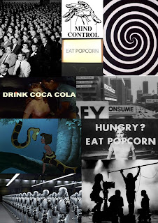
This is my mood board for our trailer. It's filled with images with a subliminal meaning. Subliminal messages that have been used in films and adverts before. This mood board explains the meaning of Subliminal messages, and gives examples.
Subscribe to:
Posts (Atom)